We haven’t told too many people this, but the free wordpress theme we’ve been using at Traveled Earth was the very first theme that came up when we googled “free wordpress theme”. We always thought it was okay, but never really loved it.
Slowly, but surely, it started to bother us more and more until we finally sat down and decided to make some changes. Behold, the fruits of our labour… the new face of Traveled Earth!
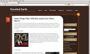
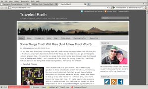
In cliche fashion, here are the before and after screen-shots in case you forgot how we used to look.
- Old Traveled Earth – click for larger image
- New Traveled Earth – click for larger image
So what do you think? Pretty snazzy eh?
Aside from the good looks, this theme also has a ton of new features.
- New About Traveled Earth and About Mike & Ashley pages so you can actually learn who we are.
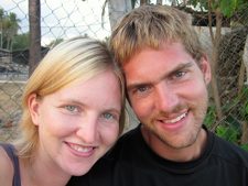
- Our photo and a brief description of us is prominently located on on the main page (we had lots of complaints about the lack of this feature in the old theme).
- A snappy random header. We launched with only 3 images, there will be more to come as we take them.
- Easy to find icons for Twitter, Facebook, and our RSS feed
- A mini-map showing our location in the world
- A search bar
- The post author is now displayed on the main page
- A larger menu bar, allowing us to move our Planning the Trip articles off of our right hand sidebar
All in all, we’re much happier with our new look.
In other news, Ashley and I have only two working days left and one paycheck each. We’re expecting to have a bit more time over this next week to finish off some of our planning the trip posts. Unless we are way off base, expect to see an unusually large number of posts coming out over the next week leading up to ‘T’ minus 0.


Nice work on the redesign. I like the tightened look. I used to have rotating banner photos on my site, and now I’m thinking I should bring them back!
I like your slide show Kris, looks good.
Nice new look guys!
Thanks Ange.
Been reading you guys for a while now — looking forward to living vicariously through you starting in a week! Oh, and I usually read through Google Reader, but the new theme looks fantastic. Nice work!
Katie, I do most my reading through google reader too. I don’t know how I’d follow blogs without it. Thanks for the comment, the new theme was a lot of work, but worth it.
Looking good guys! A much cleaner, prettier design – very impressive.
Yay, less than a week to go! 🙂
I know, this time next week we’ll be settling down to bed in Cancun! You guys must be getting pretty excited too, this last month has just flown by.
Looks great guys. Can’t wait to start reading stories from your travels.
Thanks Megan. Looking forward to writing some travel stories. Not sure if we’re going to make it down to Guatemala in time to cross paths, it’s pretty tight timing for us. We’ll have to keep in touch and work something out at some point. Central America isn’t that large.